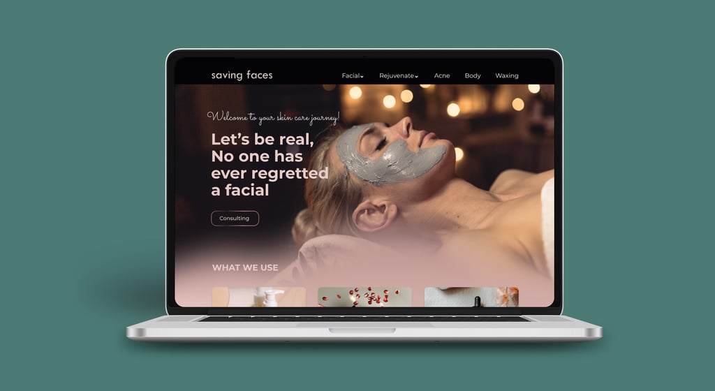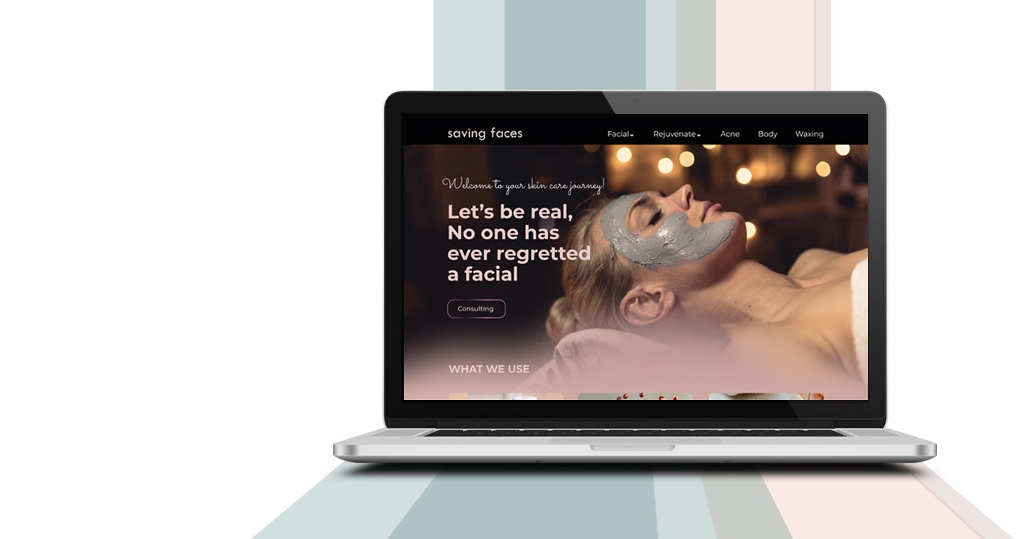
Redesign of website for skincare services.
Saving faces
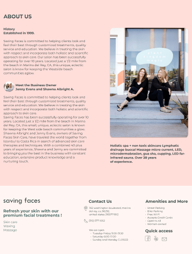
Saving faces is a skincare brand based in Los Angeles, founded by two friends, focusing on organic facial treatments, massages, and waxing services. This brand strives to meet diverse skin needs and preferences.
About Saving faces


Task Definition:
Booking a facial acne treatment.
Project Overview
Business golas
Make the design more interactive.
Online Bookings: Implement a functional and user-friendly online booking system.
Enhance Customer Satisfaction: Improve overall user experience to boost satisfaction and loyalty.
Create categorize services: To improve client accessibility and help users find and purchase services more easily.
Business Problems
Users are abandoning their search before finding services.
Customers have to call by phone to get more information.
Lack of visual engagement with the audience aligned with business goals.
Customers are not utilizing the website to book services.
Design Thinking
My team of 2 ran a double Diamond method based on the Design Thinking Methodology. It was not a linear path, we bounced between stages as the project progressed.
Discover
We evaluated the website completely in order to find the mistakes and try to redesign it.
Heuristic Evaluation
Competitive Analysis
To gather the necessary information, we conducted a competitive analysis by investigating websites with similar business models. We examined their features and drew inspiration from their strengths.
Our Competitive Analysis Goals:
Identify Key Categories
Explore Service and Design Methods
Evaluate the Booking Process
Identify Common Features
Areas for Improvement:
Increase Online Booking: Implementing an easy booking system could significantly improve user experience and competitiveness.
Product Information: Adding details about the products used in services would provide transparency and could attract users who are particular about what products are used on their skin.
Service Categorization: Organizing services into categories would make it easier for users to browse and select the service they need.
Include Photos: Incorporating photos of services could increase user confidence and interest, as visuals often help in the decision-making process.
Survey
To initiate the project, we sent a survey to prospective users. We received a total of 21 responses. Here is the important information we gained through the survey.
Interview
We interviewed 6 people to learn about their facial experiences and the challenges they faced when booking appointments online.
Some quotes mentioned by people in interviews.
A view of the initial website
Define
Persona
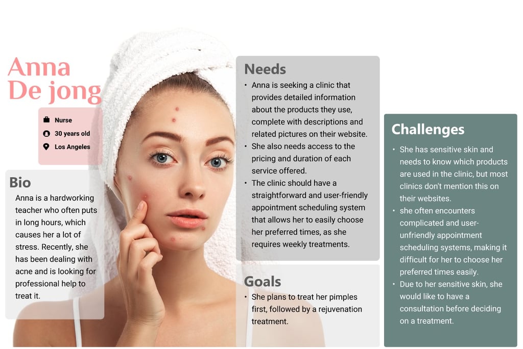
The persona has been defined based on user research and the website will be redesigned based on the persona’s needs and preferences.
Information Architecture
The results of the interviews, surveys, and competitive analysis helped us create categories and subcategories in the sitemap that are both understandable to the user and address their most important needs.
User Flow
This diagram shows the steps a user takes to book an appointment at the website, from their first interaction with our service to completing the booking.
Challenges & Solutions
We organized the information we got from the interview using the affinity diagram and we identified the most important factors to consider.
key Takeaways
Affinity Diagram
Develop
Sketches and Low Fidelity Wireframes
Mood Board
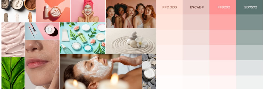
The colour palette we created was inspired by our mood board. Based on the mood board, we chose 4 colour as the primary colour.
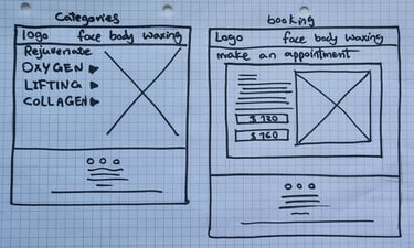
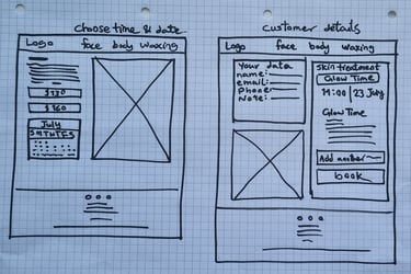
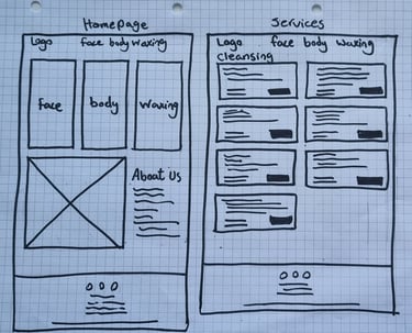
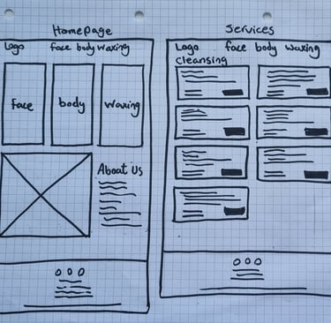
We created low-fidelity wireframes by hand sketching to map out our Ideation which helped us in the early stages of the design to go forward and have better communication within the team.
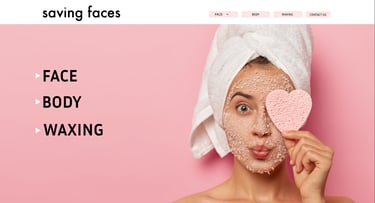
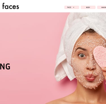
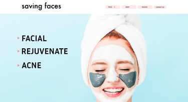
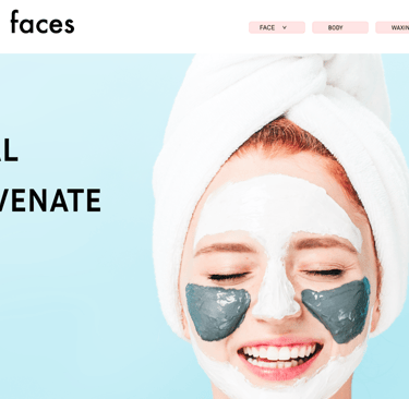
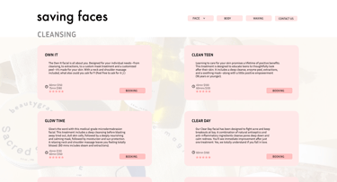
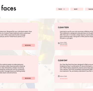
Our goal in creating the initial wireframes was to conduct user testing to evaluate their ability to navigate the categories and find the desired services easily. Throughout the process, we made several changes to improve user performance and experience.
Mid Fidelity Wireframes
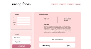

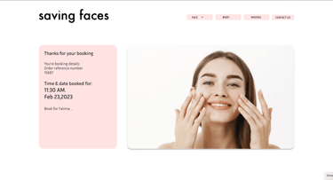

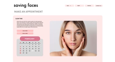
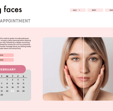
We developed a design system to ensure consistency across all pages of our product, including typefaces, colors, assets, CTA and grids. The simplicity of the design is achieved through the use of ample white space, and a minimalistic approach.
UI kit
Deliver
Iterations
Throughout the project, we made several changes based on insights from usability tests on mid- fidelity wireframes. These tests played a key role in guiding our decisions and continually improving the project.

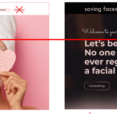
In the initial tests, we discovered that users had to navigate through many pages to reach their desired service. Additionally, users could not find the way to reach the desired service easily.
To minimize clicks, reduce frames, and improve user understanding, we divided the categories into smaller sections by splitting the face menu into 3 parts:
1.Facial 2.Rejuvenate 3. Acne

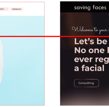
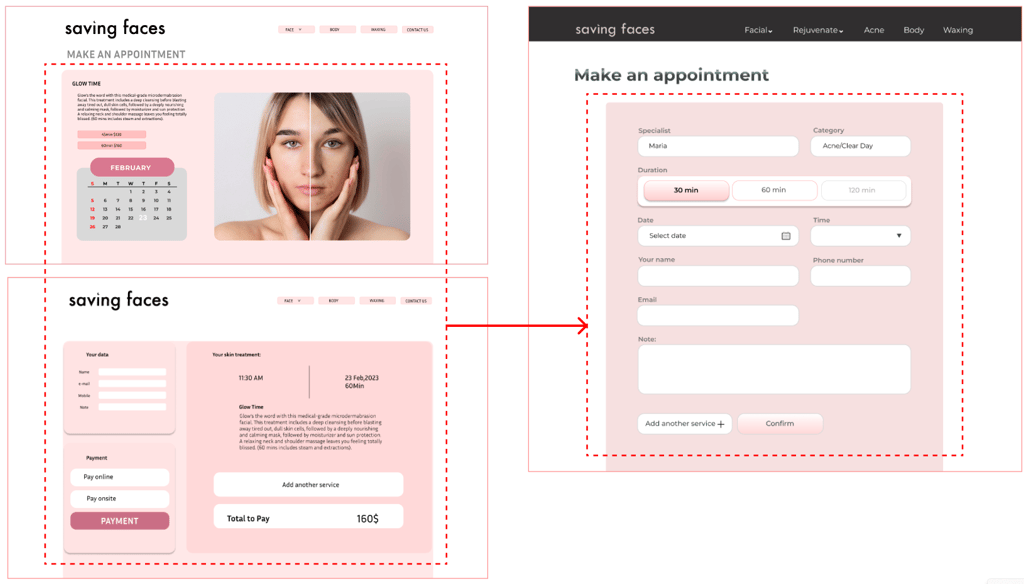
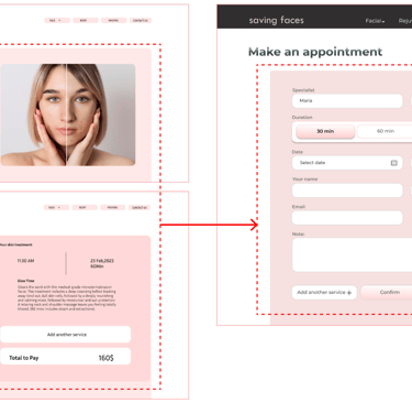
This is the second frame that appears after clicking the Face menu. Users were taken to this page but had to click again to proceed to the next page. This iteration helped us identify a flaw in the site map, prompting us to go back and refine it.
To address this issue, we revised the sitemap and implemented the dropdown menu, which displays the facial menu subsets directly.
Based on usability testing, we merged the frame of day and time selection with the frame of customer information. This combination streamlined the booking process, making it more convenient for users.
Lading Page
Services
Make an appointment

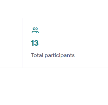
Usability test
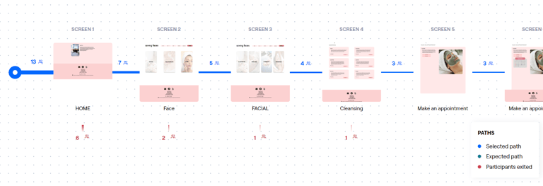
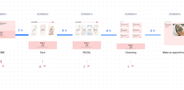

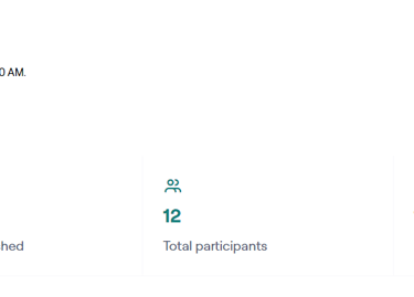

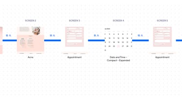
In the mid-fidelity wireframes phase, we conducted usability tests to evaluate how users interacted with our categories and services. We discovered that most users struggled to find their desired service, particularly within the subcategories. Only 3 out of 12 participants successfully booked the service they wanted. As a result, we revised our information architecture and conducted more tests.
Before the modifications, only 23% of participants managed to complete the process. However, after revising the information architecture, 91.7% were able to easily find their desired service and complete the reservation process.
Before Iteration
After Iteration


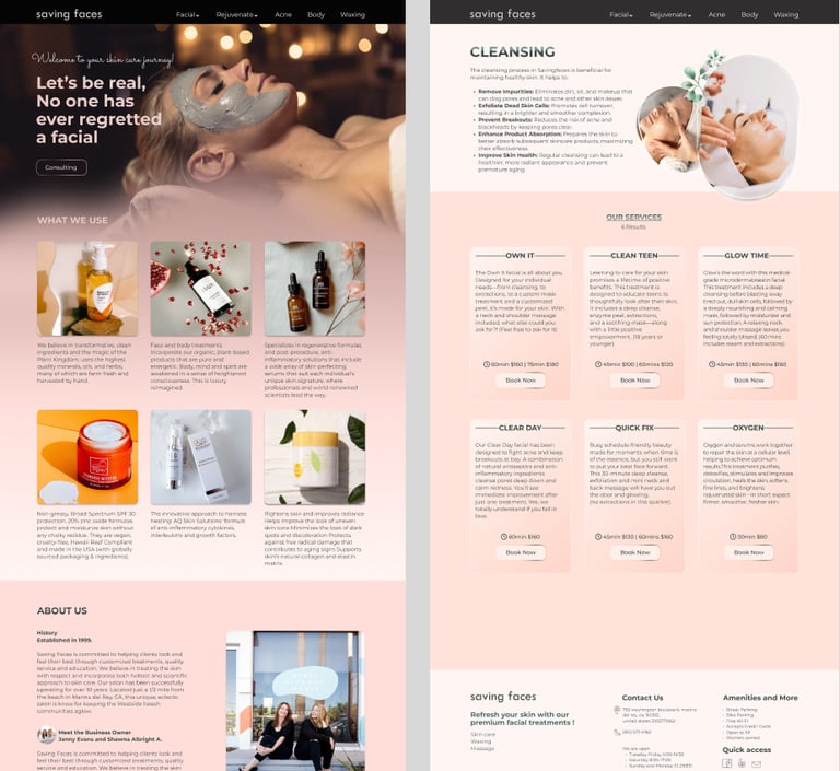
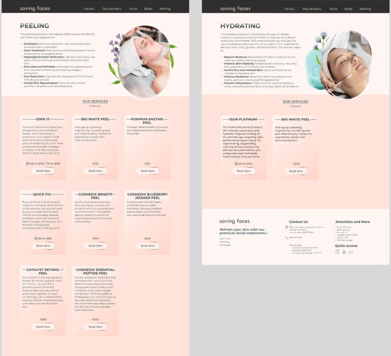
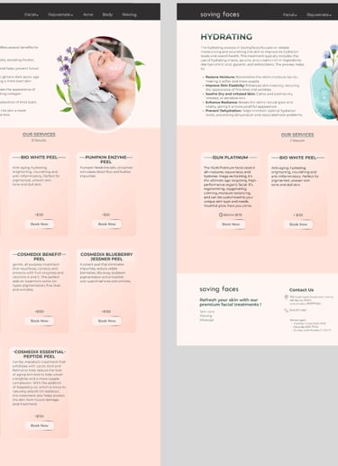
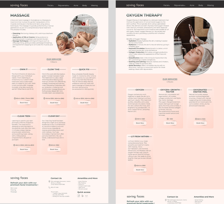
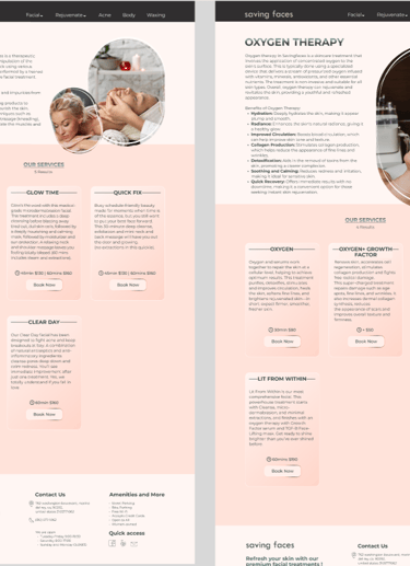



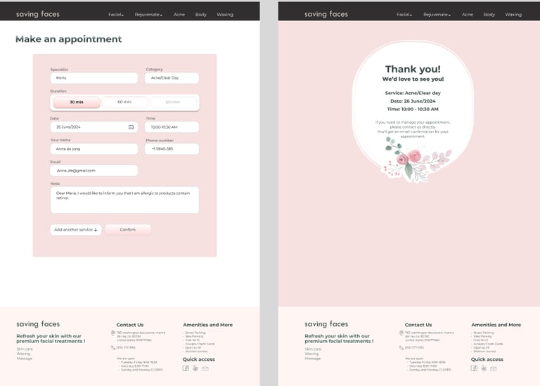
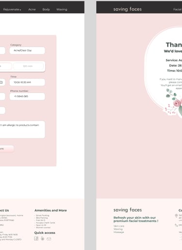
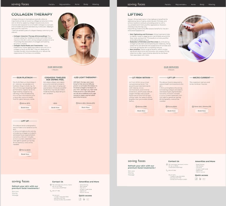
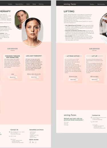
High Fidelity Wireframes
Cleansing
Lading Page
Peeling
Hydrating
Massage
Oxygen Therapy
Collagen Therapy
Lifting
Appointment
Confirmation
Reflection
The importance of information architecture for designing a user-friendly website.
The critical role of research in enhancing product effectiveness.
Team collaboration for timely delivery and meeting deadlines.
Testing and iteration for improved user-friendliness.

