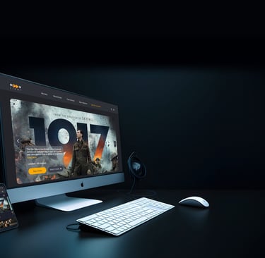
Design of a cinema website for desktop and mobile version.

Moonlight Cinema
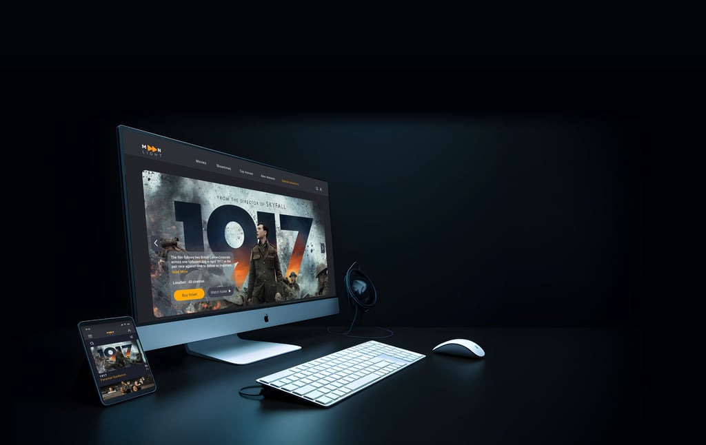
Moonlight is a cinema based in London with multiple branches across the United Kingdom. In addition to screening films, Moonlight offers facilities including dedicated halls for special gatherings and birthday parties. The Moonlight Cinema website also allows users to conveniently book tickets online.

About Moonlight Cinema

The Task is to book 2 tickets for an adventure film, 2D format, location set in London.

Project Overview

Timeline

Team

Tools

Role

Seamless Booking Process: Simplifying the ticket purchase process through online booking to increase sales.
Value Proposition: Clearly display the unique features and benefits of the cinema.
Improve customer satisfaction: By providing more comprehensive information and user-friendly design.
Additional Services: Highlighting other services like food and beverage options, private screenings, and loyalty programs to attract and retain customers.

Business Goals

Target Users

Individuals who are eager to find a movie from among various genres and do not have a specific idea yet.

Users who know the name of their favourite movie and are looking to book it.

The task is to design the ticket booking process for this groups.

Figma, FigJam

Adobe Photoshop

Google Form, Maze

UX/UI designer Photoshop.Google form.

Group of 4 Photoshop.Google form.

8 weeks

Design Thinking

Our team of 4 followed a Double Diamond approach based on the design thinking methodology. It was not a linear path, we bounced between stages as the project progressed.

Discover

To understand the users’ pain points and develop effective solutions, we employed a comprehensive research approach that consisted of the following methods:

1. Competitive Analysis

2. Online Survey

3. Interview

Competitive Analysis

In the initial phase, we started by identifying cinemas websites with similar objectives to gain a clearer understanding of the essential features of our design. We conducted a thorough analysis of these platforms to grasp their overall structure and functionalities, providing valuable insights for our own design process.

Survey

To deepen our understanding of user preferences, we conducted a brief survey and
collected insights from
16 respondents. Below are some key insights:

From the results of this part of the survey, we realised that what encourages users to choose a cinema, in order, are:

1. Location of cinema
2. Screen format
3. The types of movies shown in the cinema

Interview

Interviews with 7 of the participants in our survey provided valuable insights that emphasized the importance of providing thorough information in the ticketing process such as clear seat map, ticket confirmation and creating a dynamic and user-friendly platform.

Some quotes mentioned by people in interviews:

We identified key factors for presenting a movie to the audience. We noticed that on these websites, movies are categorised in several ways: By the new releases, genres, top movies and show times. The information about each film includes its runtime, parental guidance, and a trailer of the movie. We also checked the ticket purchasing process on each of them.

The most important features for choosing a movies were access to:
1. The genre
2. Movie trailers and actors
3. Seat map
4. Runtime and the schedules

We also found that users prefer categories to be organised into:

1. New release and best sellers
2. Based on show times

Define

Persona

The insights I gathered from surveys and interviews culminated in the creation of the persona. The primary objective is to highlight those patterns and pain points, which enabled me to better understand and empathise with users.

Sitemap

User Flow

The information architecture we developed was based on our research and the data that we collected from users.

Header Navigation

1.Trust through accurate and comprehensive information
Users want to receive all important movie details such as the runtime, seat number, movie trailer, and ticket confirmation.
2.Categorisation by genre, bestsellers, and newest releases
For searching their favourite movies, the most requests were for easy and convenient access to genres.
3.Parental guidance
Age restriction guidelines should be included alongside each movie.

Key Takeaways

Affinity Diagram

With creating the affinity diagram we identified the most important factors to consider.

Develop

Solutions

Challenges

Confusing Booking Process.
Ensuring
all necessary information (movie details, parental guides, runtime, trailers) is easily accessible.

Streamlined Booking Flow.
Design a step-by-step booking process with clear progress indicators.
select movie > choose showtime > pick seats > confirm payment.
The
necessary information for the user is clearly structured, hierarchically organised, and placed in appropriate and accessible locations.

Complex Navigation
Ensuring users can easily find movies, showtimes, and purchase tickets without confusion
.

Simplified and User-Friendly Navigation: We designed a Clear navigation bar that highlights key sections such as "Movies," "Showtimes," "Top movies" and "My Account."and All movies classified by genre, location and Film format.

Difficult Navigation and Selection on Seat Map.
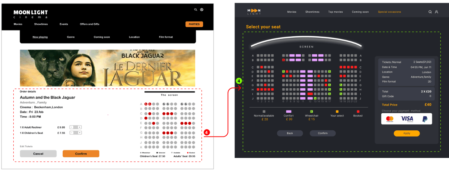
Poor visualisation of premium or special seats. Designing an intuitive seat selection process, especially for users unfamiliar with the layout of different cinema salon. Also, users with disabilities should easily find their own seats.

Intuitive Seat Map Interface.
We designed interactive seat maps with clear markers for
available, reserved and premium seats, all with color-coded guides. we ensure each seat is clickable and changes color to indicate selection, making it clear which seats have been chosen.
Also, special seats for the
disabled are marked.
Low Fidelity Wireframes

We initially mapped out our ideation using hand-sketched low-fidelity wireframes, aiding communication within the team during the early design stages. Later, we transitioned to creating low-fidelity wireframes on Figma to visualize page layouts and design direction. These wireframes underwent several iterations before final content development.

Sketches

Home page

Movies

Movie details

Seat map

payment

Mid-fid wireframes

Mood Board

We were inspired by how cinema brings people together, creating shared experiences. Our design aims to capture the excitement of movies, encouraging users to dive into new stories and adventures. We hope to motivate visitors to explore different genres, discover new favourites, and enjoy the communal joy of watching films.

UI kit

Deliver

High Fidelity Wireframes

Home page

Movies

Movies details

Movies details

Payment

Confirmation

Desktop Prototype

Here is the last prototype, displaying what we've achieved through our design process. The Task is to book 2 tickets for an adventure film, 2D format, location set in London.


Iteration and Usability Test

Throughout the project, we went through multiple iterations, driven by the insights we gained from usability tests. These tests were instrumental in shaping our decisions and constantly enhancing our project.

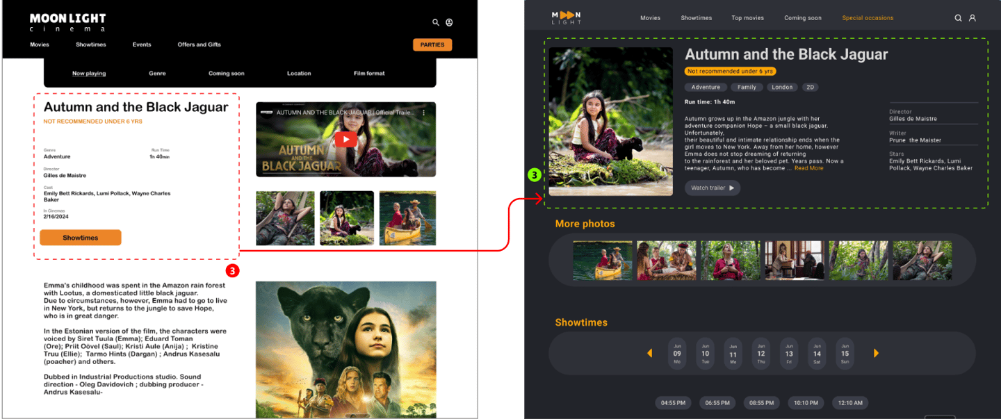
Before usability test
(Mid fid)

After usability test
(High fid)

At the initial stages of design, we arranged the menus based on the site map we prepared during the define phase. We aimed to make them identifiable and accessible at first glance. However, during usability testing, we realized that the user needed to click 3 times to filter. To minimize the number of clicks and enhance user-friendliness, we changed our design.

We narrowed the navigation bar and placed genres, locations, and movie formats in subcategories. In the showtimes menu, priority is given to the user's selected date. This means that the user first selects their desired date, and based on that date, the available movies in the cinema are shown.

We also realized that displaying videos in three small frames on the main screen reduces the impact of posters.

we changed it to a single large frame with a trailer button and a short summary of the film. Additionally, we changed the white background color to gray, which is a neutral color, to enhance the attractiveness of the movie posters.

In our initial usability testing, we noticed an incorrect layout on the movie information page. We had placed the movie synopsis in a separate section, which required the user to scroll down to reach it. For viewing the movie schedule, the user had to scroll back to the top of the page and the movie schedule information would open at the bottom of the page.

To create a better design and prevent user confusion, we moved all the movie information to the top section and added a "Read More" option. This allows the user to read the rest of the content if they wish. Additionally, we achieved consistency and coherence in the design.

After usability testing in the seat map section, we noticed that users spent more time than expected in this part. Rows A, B, C ..., were specified, but seat numbers were also needed. Additionally, a lack of sufficient information was discovered in the guide. Moreover, the screen, which was designed as a straight line, was hidden from the view of some users.

Adding seat numbers, creating a specific color for comfort and wheelchair seats, and redesigning the screen helped users pass through this stage more quickly.

Usability Test Results

Before Iterations

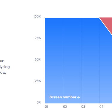
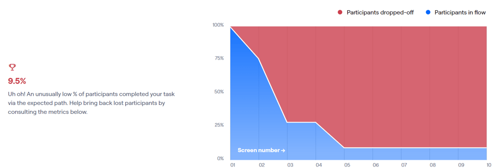
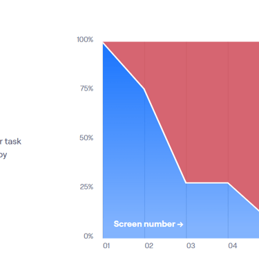
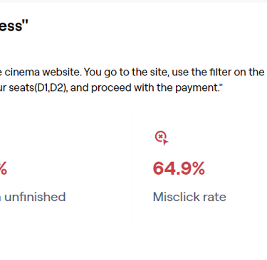
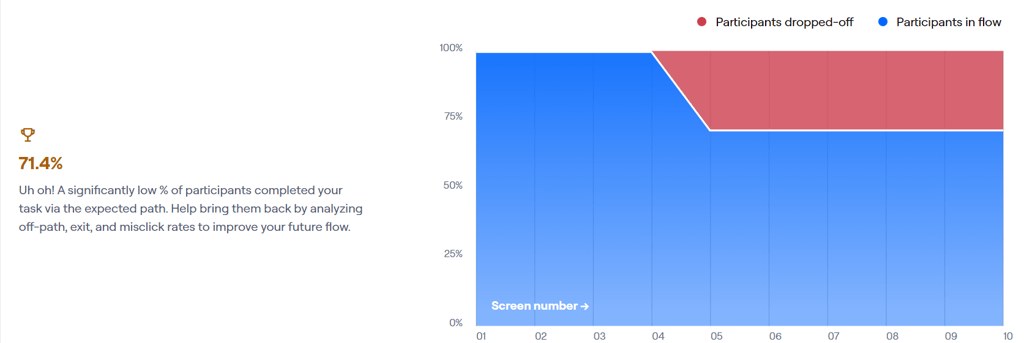
In the initial user test, only 9.5% of participants were able to successfully complete the ticket purchase stage, while 64.9% of the clicks were incorrect.

After Iterations

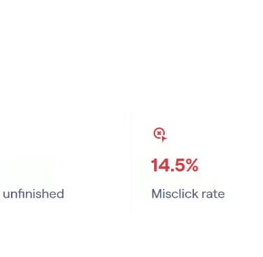
After redesigning and retesting, the success rate for ticket purchases increased to 71.4%, which is approximately a 60% improvement compared to the previous result. Nearly all participants completed the task, but about 30% did not follow the intended paths. Also the rate of misclick decreased to 14.5%.

Mobile Prototype

The Task is to book a ticket for an adventure film, 2D format, location set in London.

Reflection

1. To create designs that truly meet users' needs, it is crucial to conduct extensive research to understand their pain points, preferences, and behaviours.


2. The design process is iterative: Design is rarely a linear journey. It typically involves cycles of ideation, prototyping, testing, and refinement. It's important to use tools like wireframes and prototypes to iterate on designs and gather feedback from users and stakeholders.


3. We've learned that good design involves creating interfaces that are intuitive, easy to use, and functional. This includes designing for usability and accessibility, ensuring that our designs are inclusive and cater to a diverse range of users.

What did we learn?

What next?

Finalizing the mobile version of the platform and evaluate the current design by doing more user testing.

Got a cool project on mind?

Let's work together.